
WE’VE SEEN THIS FACE BEFORE
How creativity changes when the subject doesn’t.

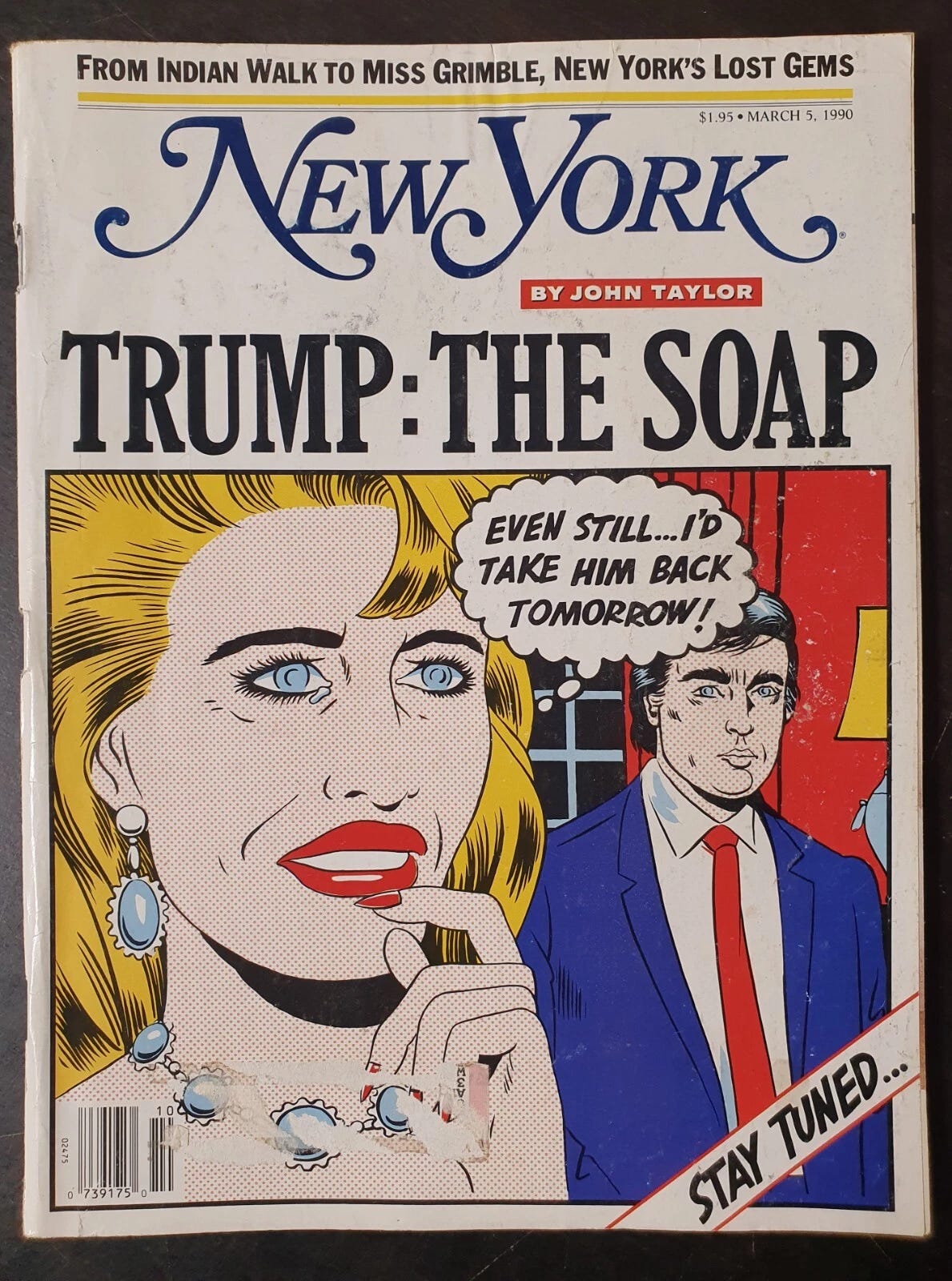
New York Magazine 1990
Donald Trump has become a constant subject in our visual culture for decades. Few public figures have been visualised as often, or in as many different ways. Looking at covers over time, a clear development becomes visible. The subject remains the same, but the tone and visual language change.
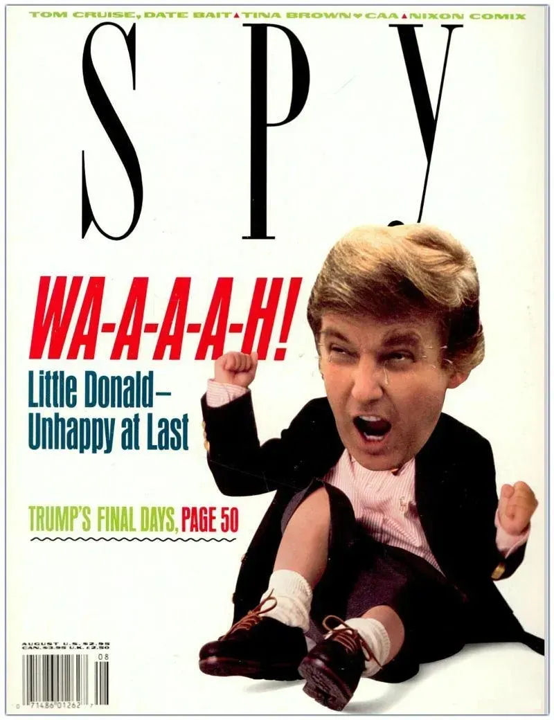
Spy magazine 1990
For me, the question is not what we think of him, but in how designers respond visually when a subject becomes inescapable.
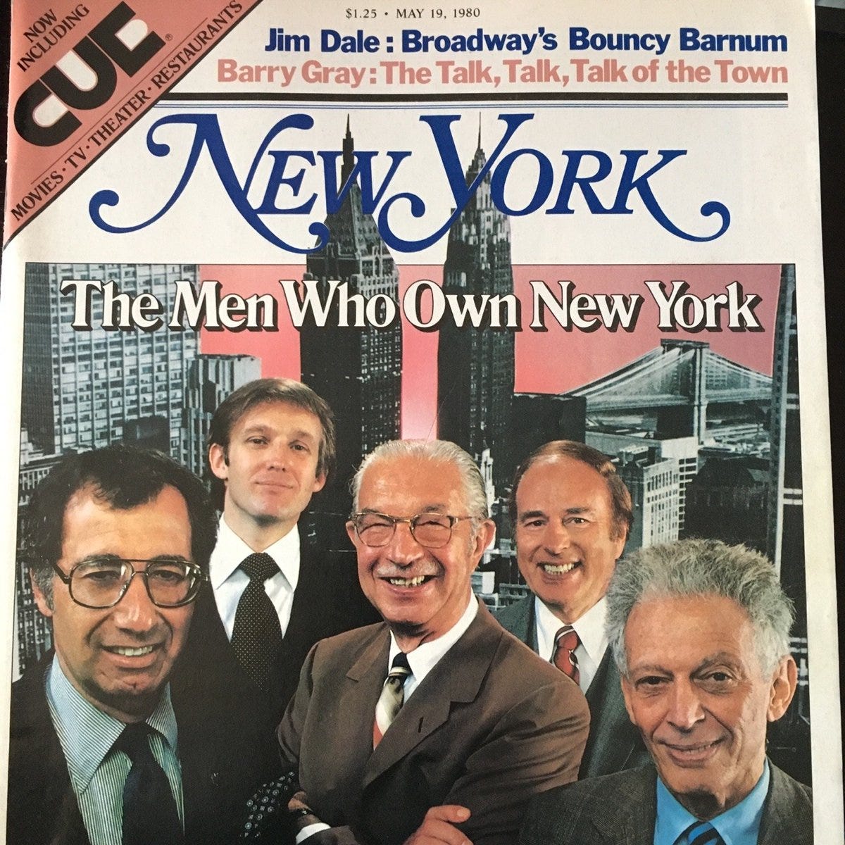
The earliest Trump cover I could find, 1980, New York magazine
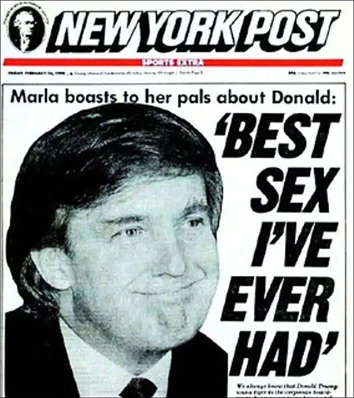
New York Post, 1990: Trump as tabloid myth after an affair with Marla Maples.
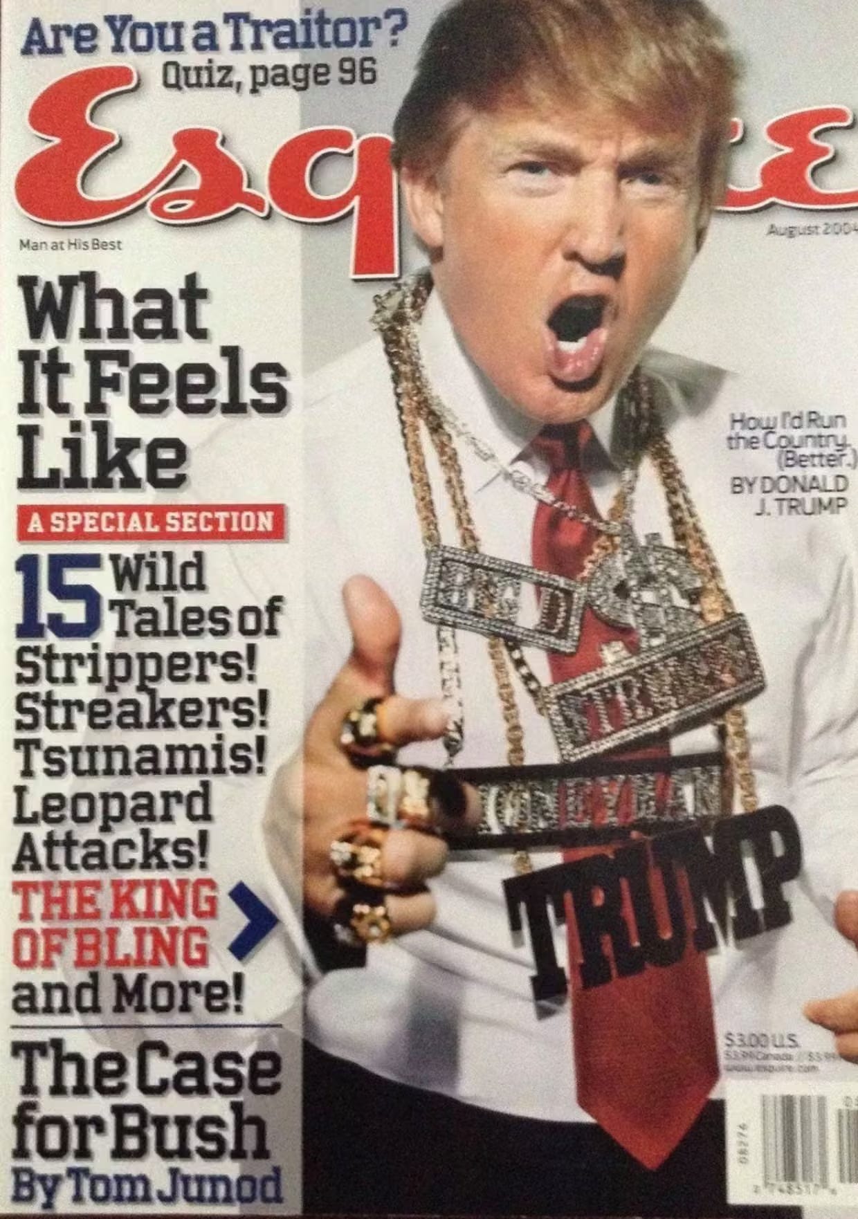
Esquire 2004
Early covers are often creative, sometimes abstract. They are direct, yet still relatively playful. Designers experiment with metaphor and exaggeration, interpreting a new and unconventional political figure. The work feels exploratory, slightly confrontational, but still inviting reflection. For me, this is the most interesting phase, also the most creatively open.
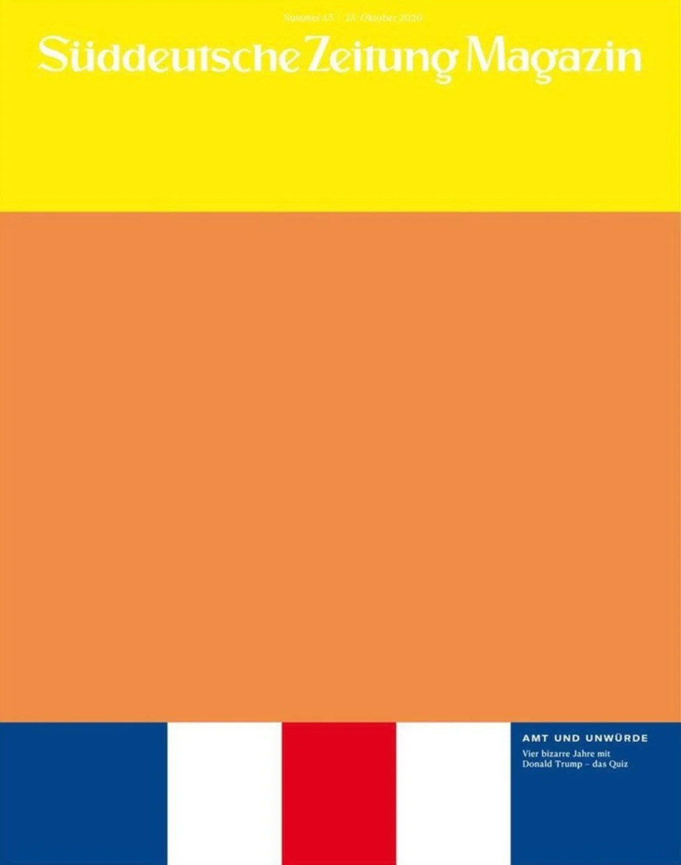
Suddeutsche Zeitung Magazin (Germany) 2020
Concept & art Jonas Natterer / Artdirector Thomas Kartsolis / Editorinchief Tim Klotzek
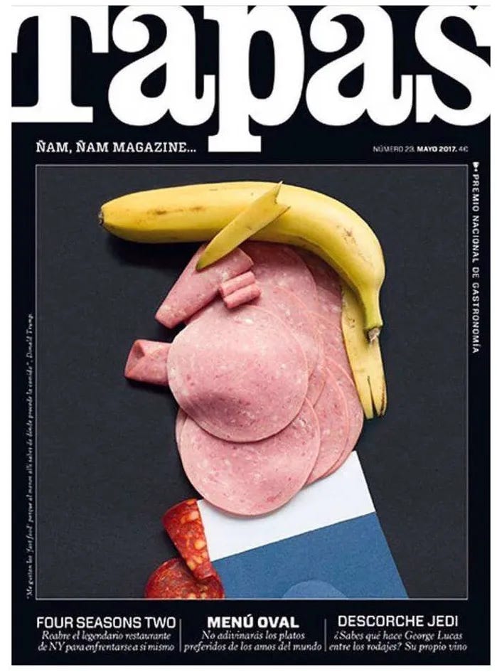
Tapas magazine (Spain) 2017
Art director Sandra de Miguel
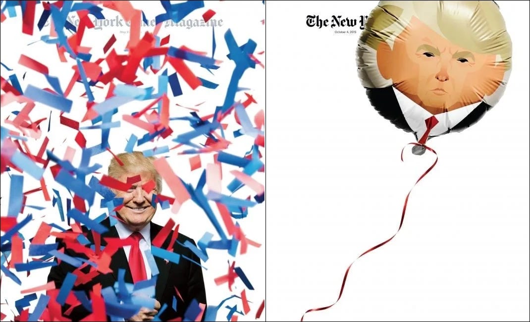
New York Times Magazine 2015
Design director Gail Bichler
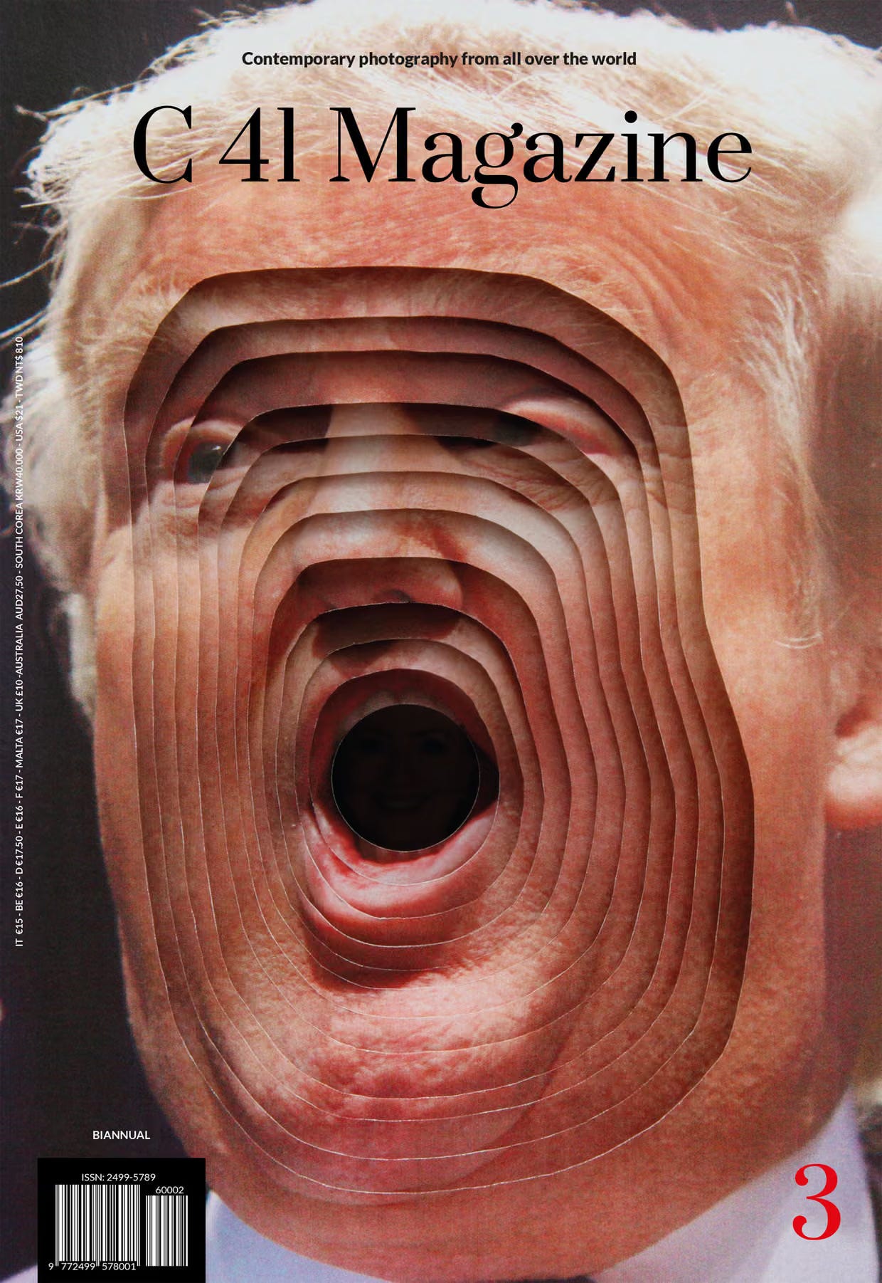
C41 Magazine, 2016 created by artist Kensuke Koike
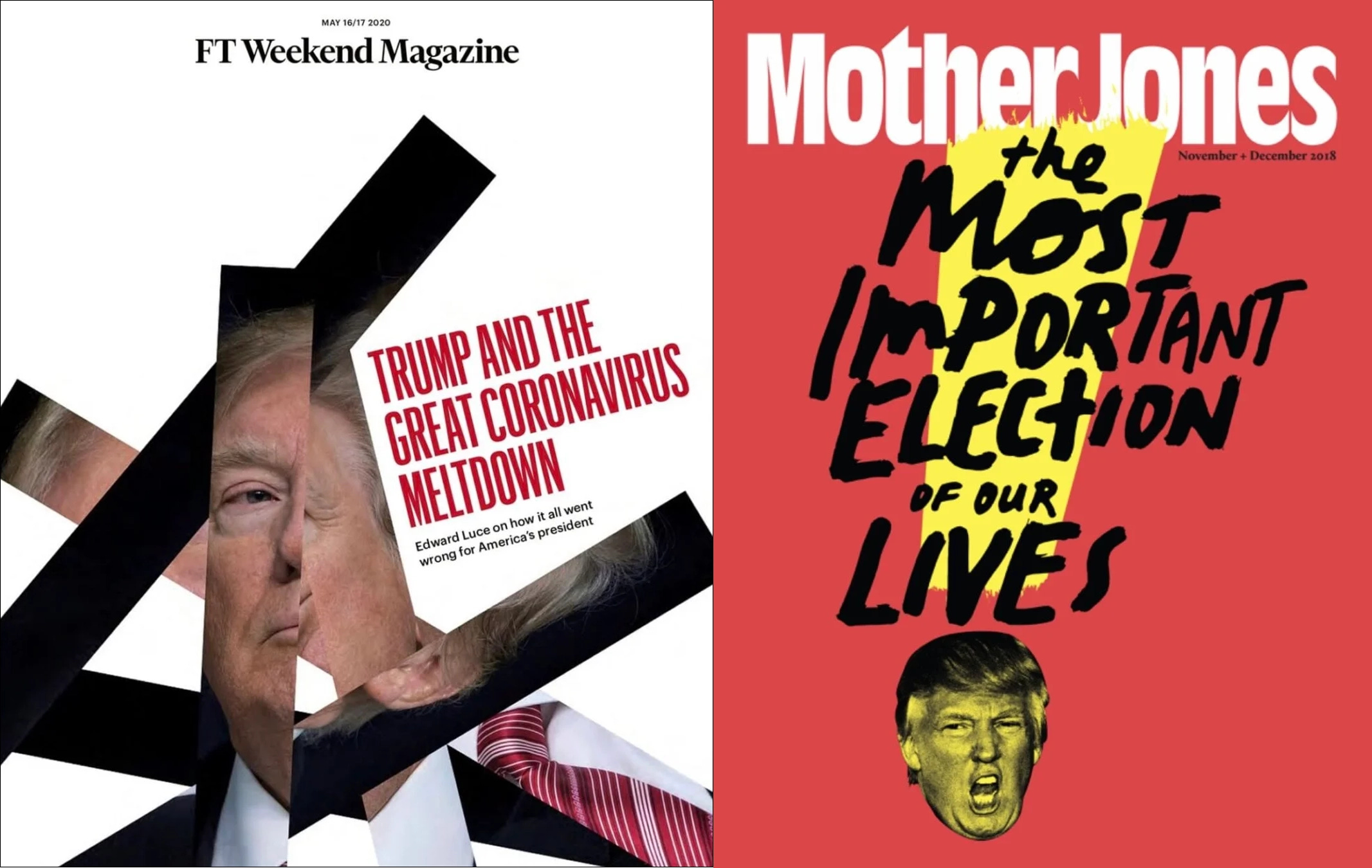
FT Weekend magazine (UK) 2020 & Mother Jones (US) 2018

Mad magazine 2018
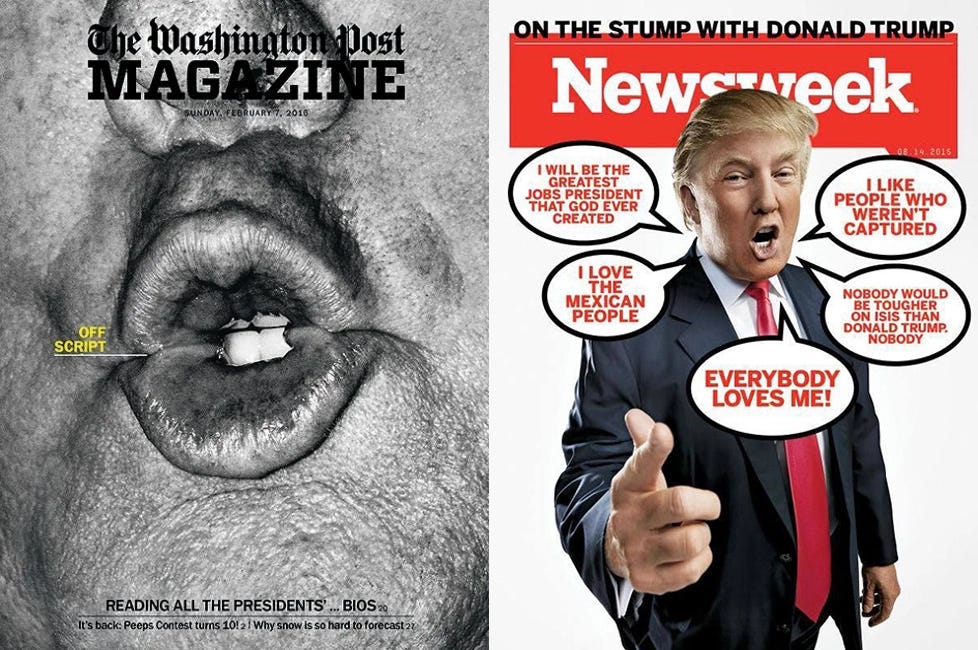
Washington Post Magazine 2016 & Newsweek 2015
That changed quickly.
As Trump becomes a constant presence, the tone sharpens. Covers become more aggressive, more explicit. Associations with the far right begin to appear. The imagery becomes heavier, less symbolic, more loaded.
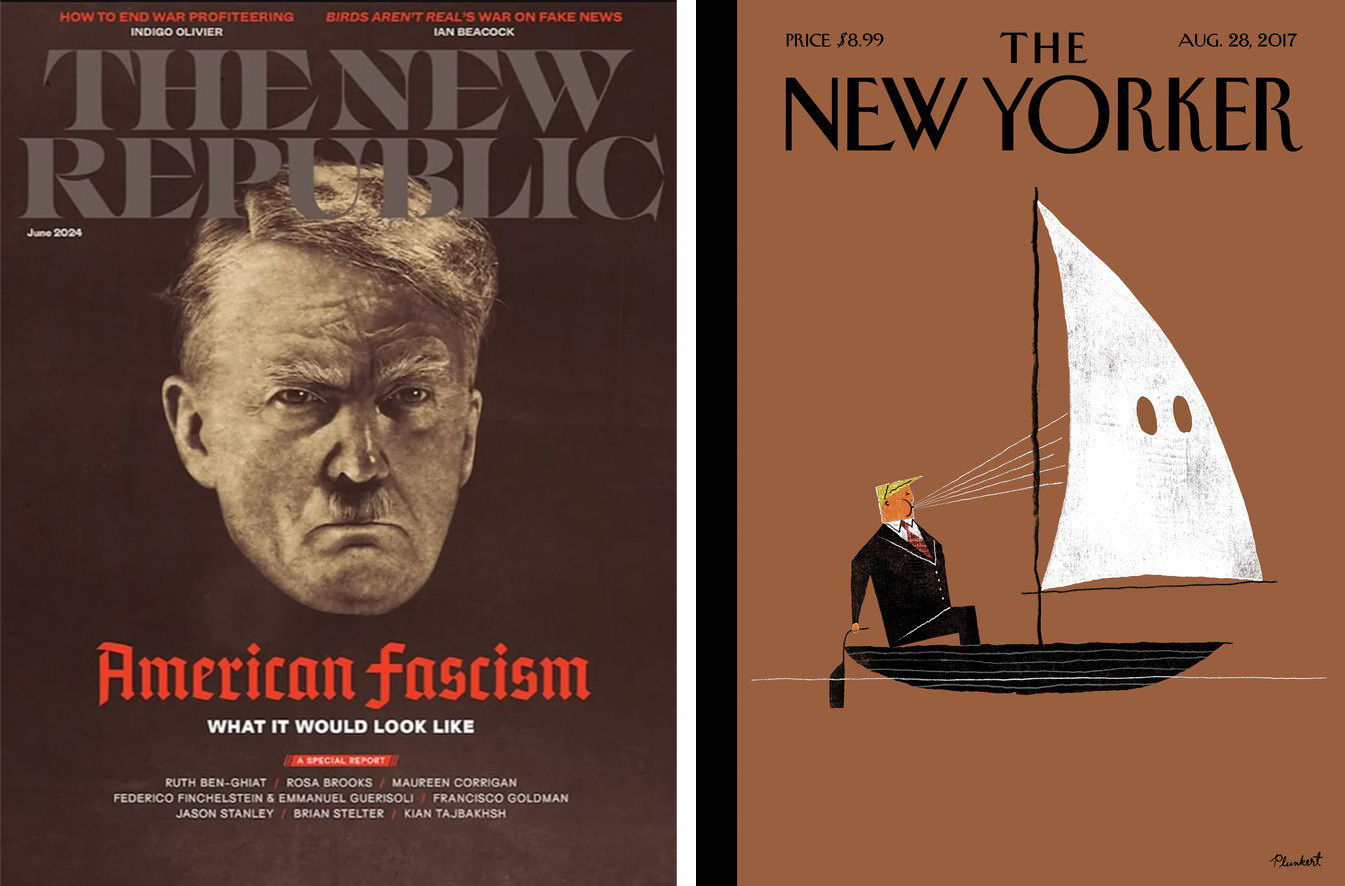
The New Republic (US) 2024 & The New Yorker (US) 2017
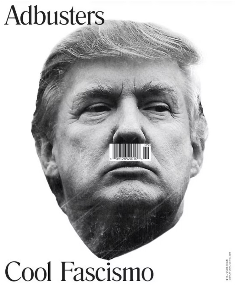
Adbusters 2016
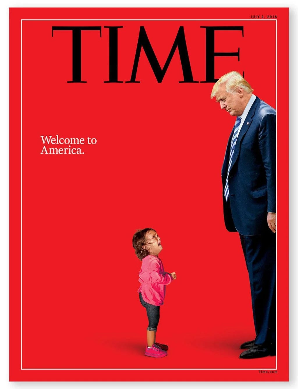
Time magazine 2018
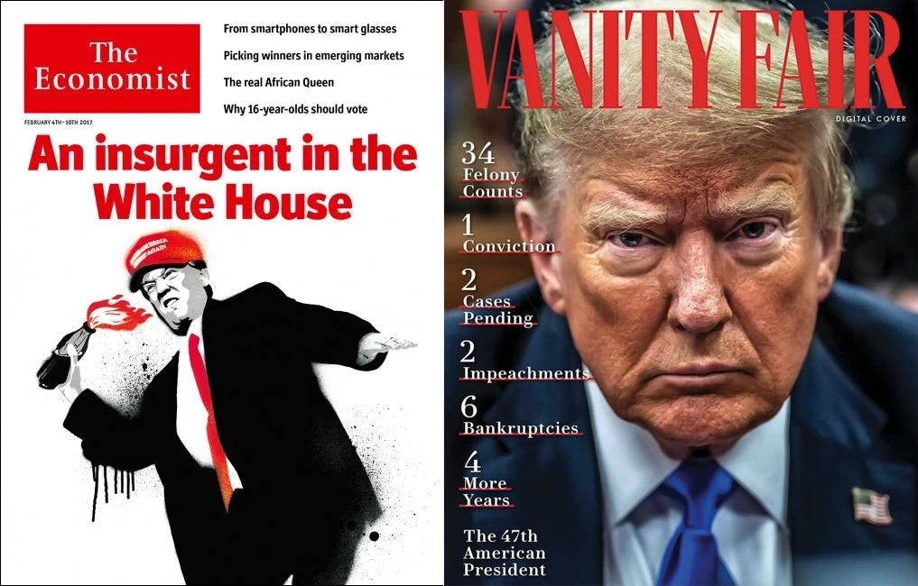
The Economist 2017 & Vanity Fair 2024
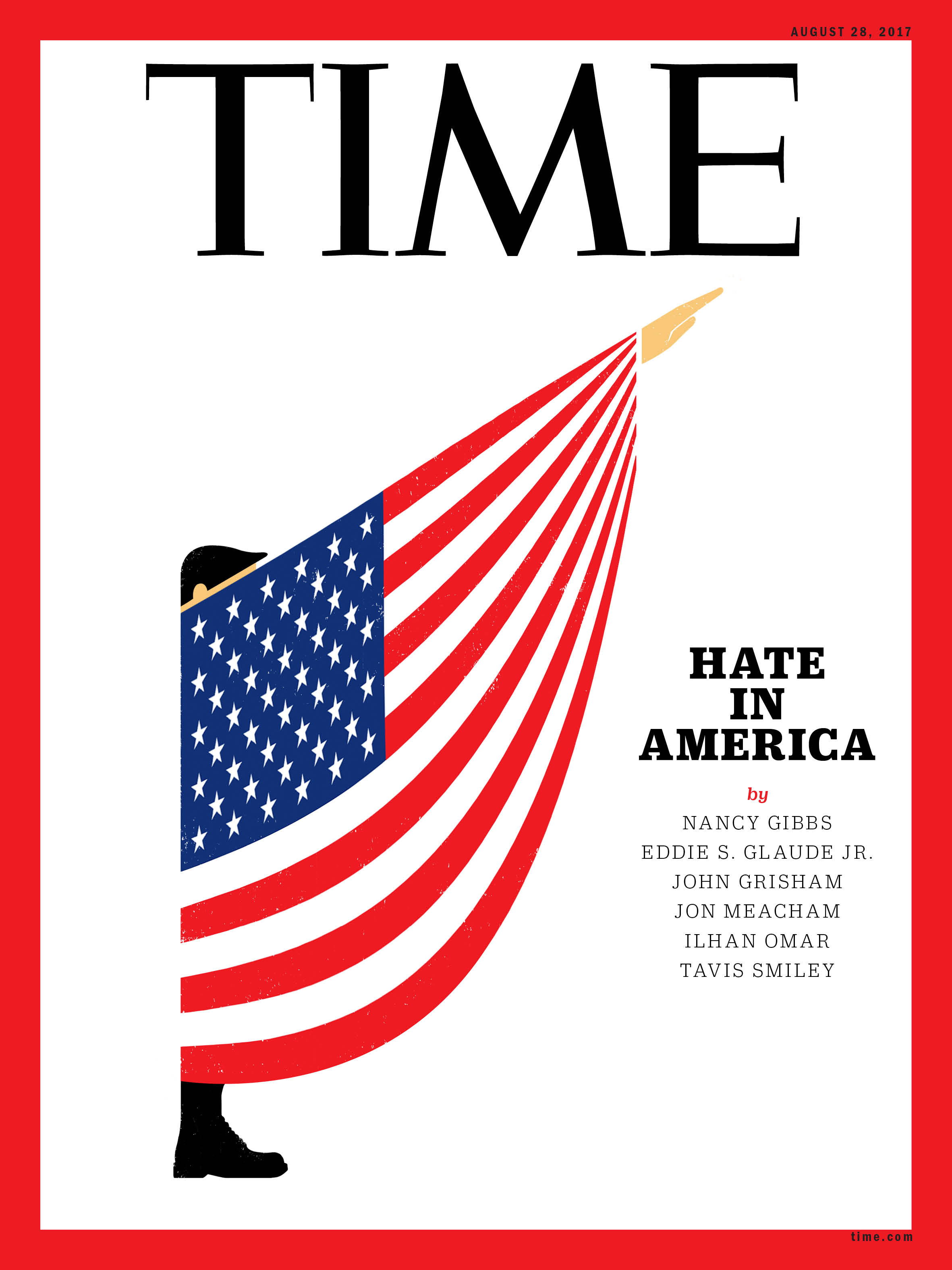
Time magazine 2017
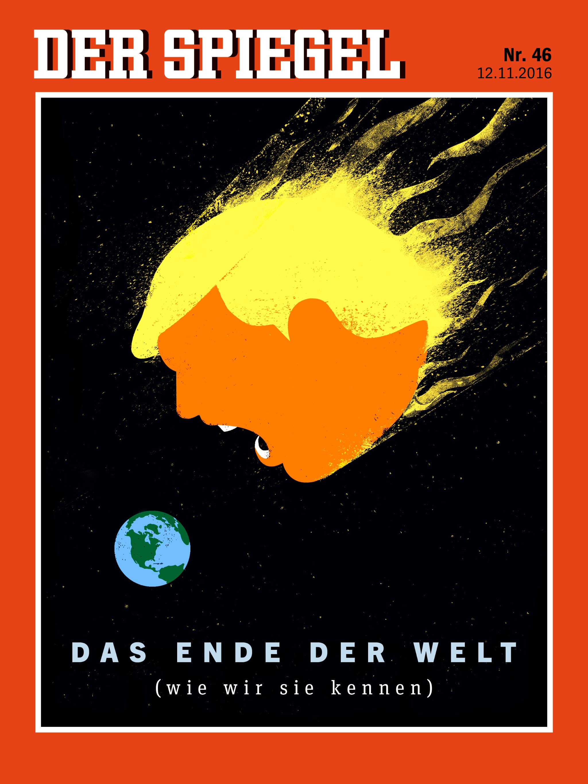
European publications, in particular, push this further. Magazines like Der Spiegel and Stern do not hold back, using strong historical references and provocative metaphors. Visual associations that once would have seemed unthinkable in relation to the office of the U.S. president start to appear.
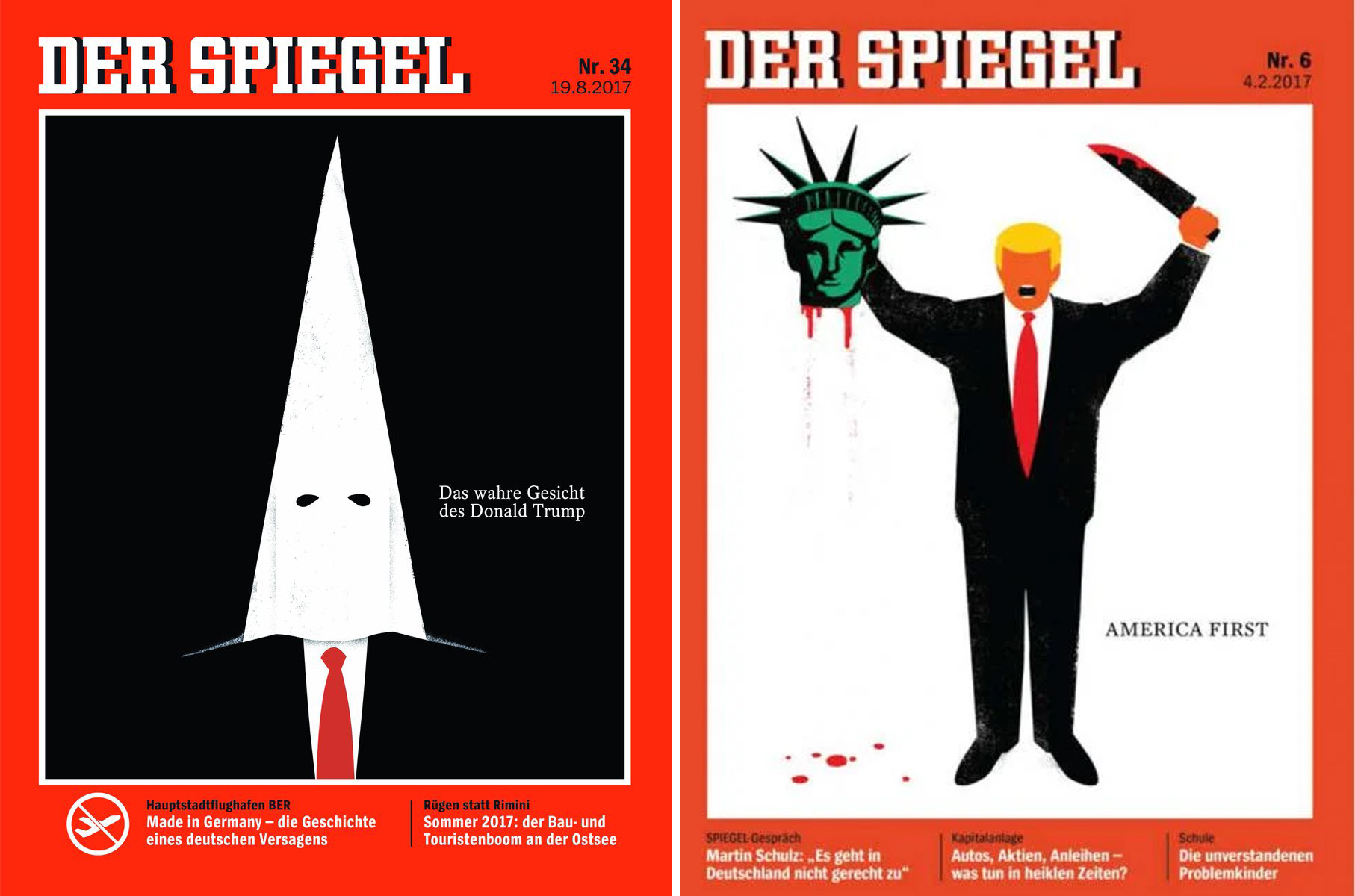
Der spiegel (Germany) 2017
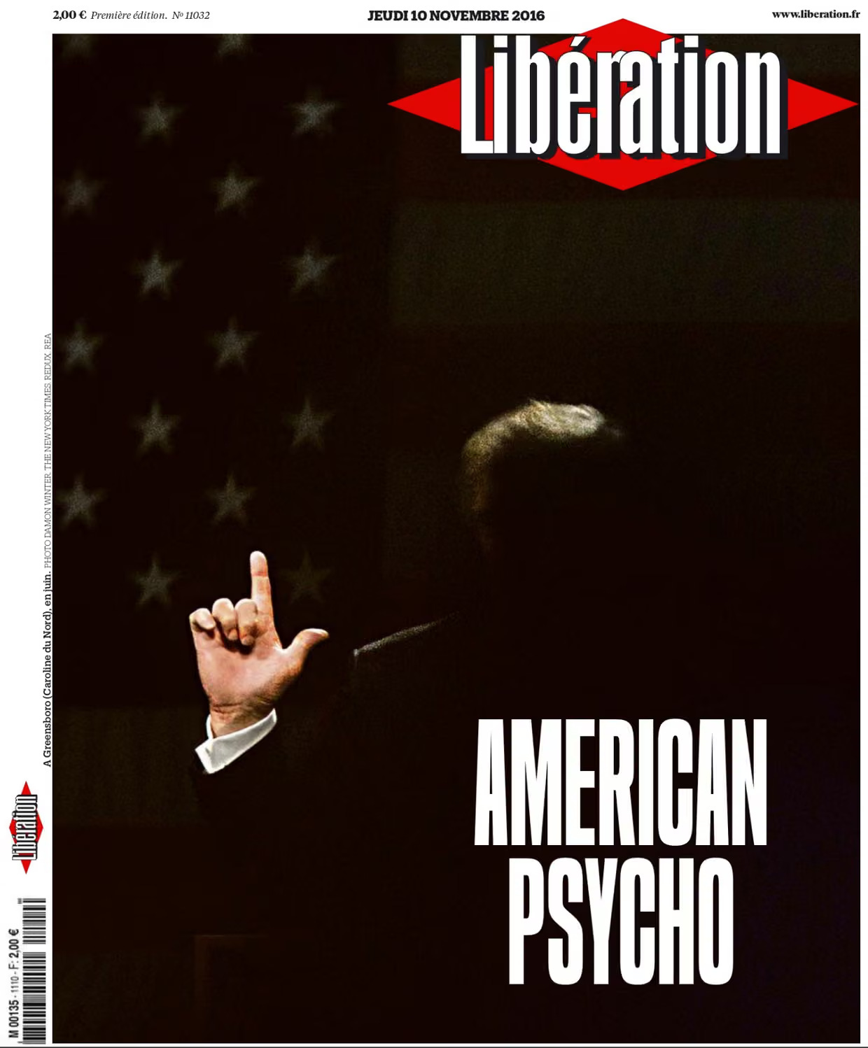
Liberation (France) 2016
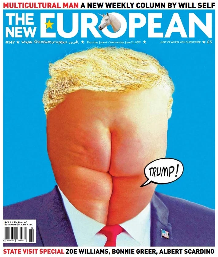
The New European 2019
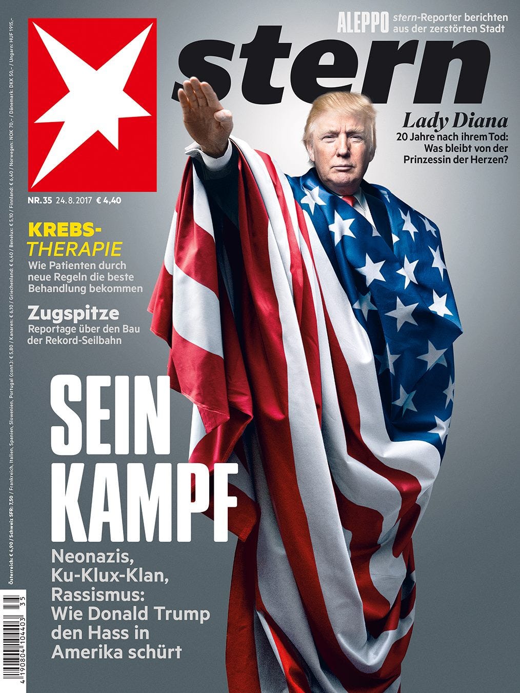
Stern magazine 2017
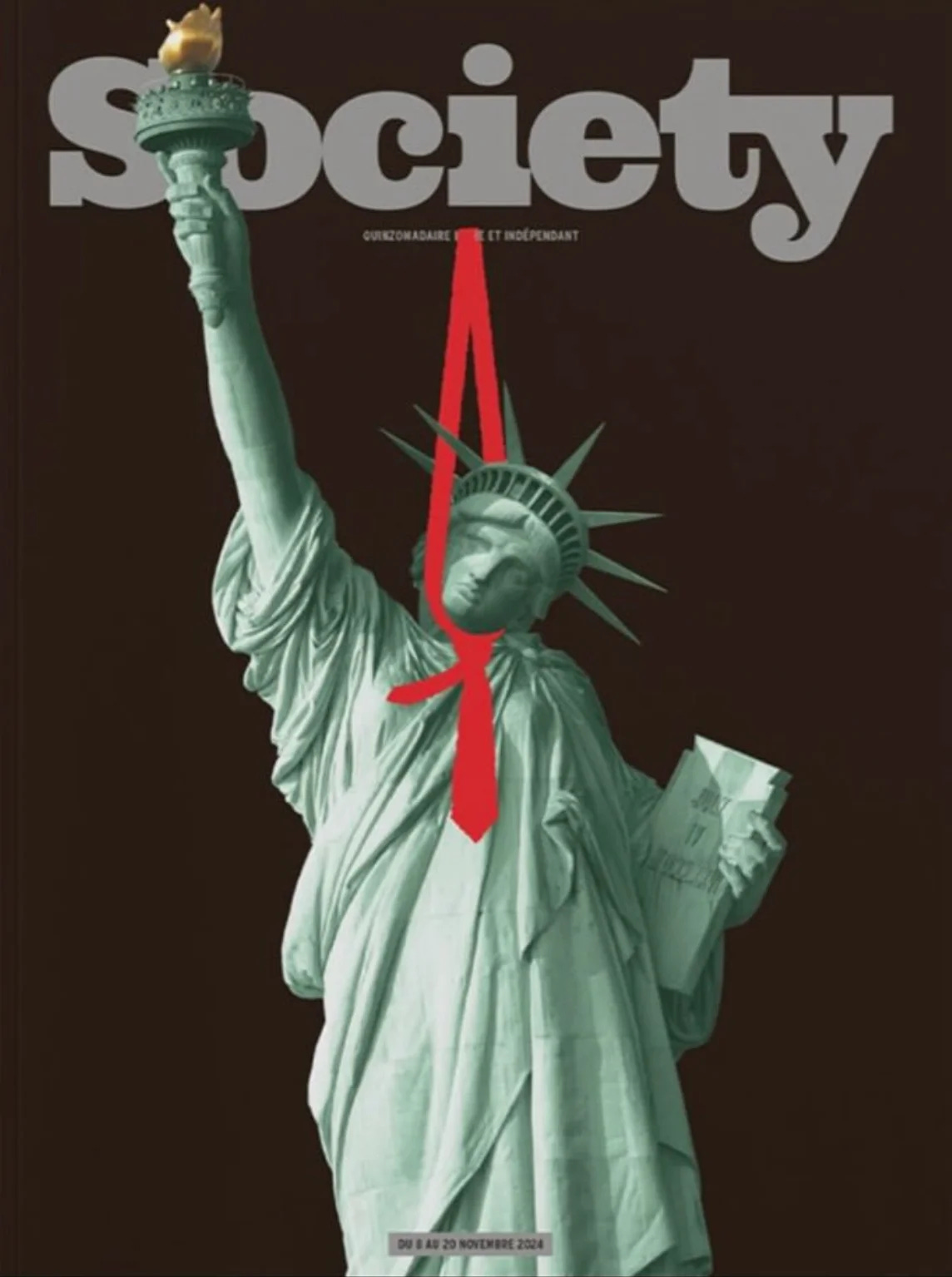
Society (France) 2024
At the same time, U.S. magazines develop their own visual language. Time plays a central role, especially through the work of great artists like Edel Rodriguez and Tim O’Brien. Their covers often build on each other — sequels rather than standalone images. One idea evolves into the next. This continuity gives the work impact and creates a visual narrative over time.
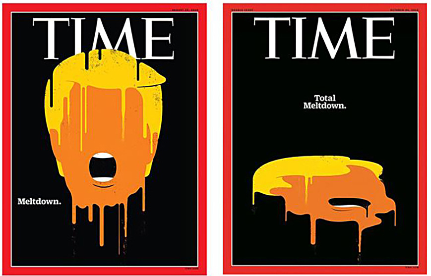
The famous sequel by artist Edel Rodriguez (I hope to do a Q&A with Edel soon)
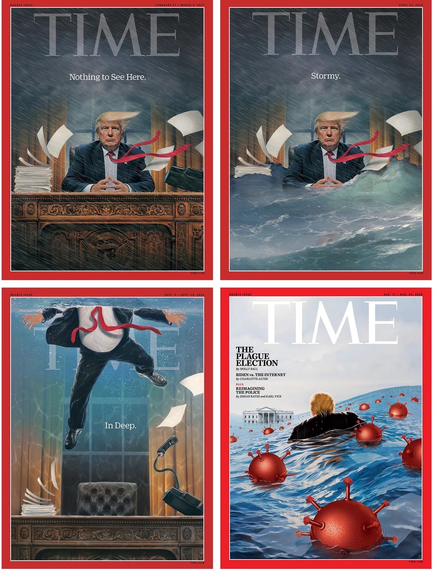
Sequence of Trump on Time covers by artist Tim O’Brien
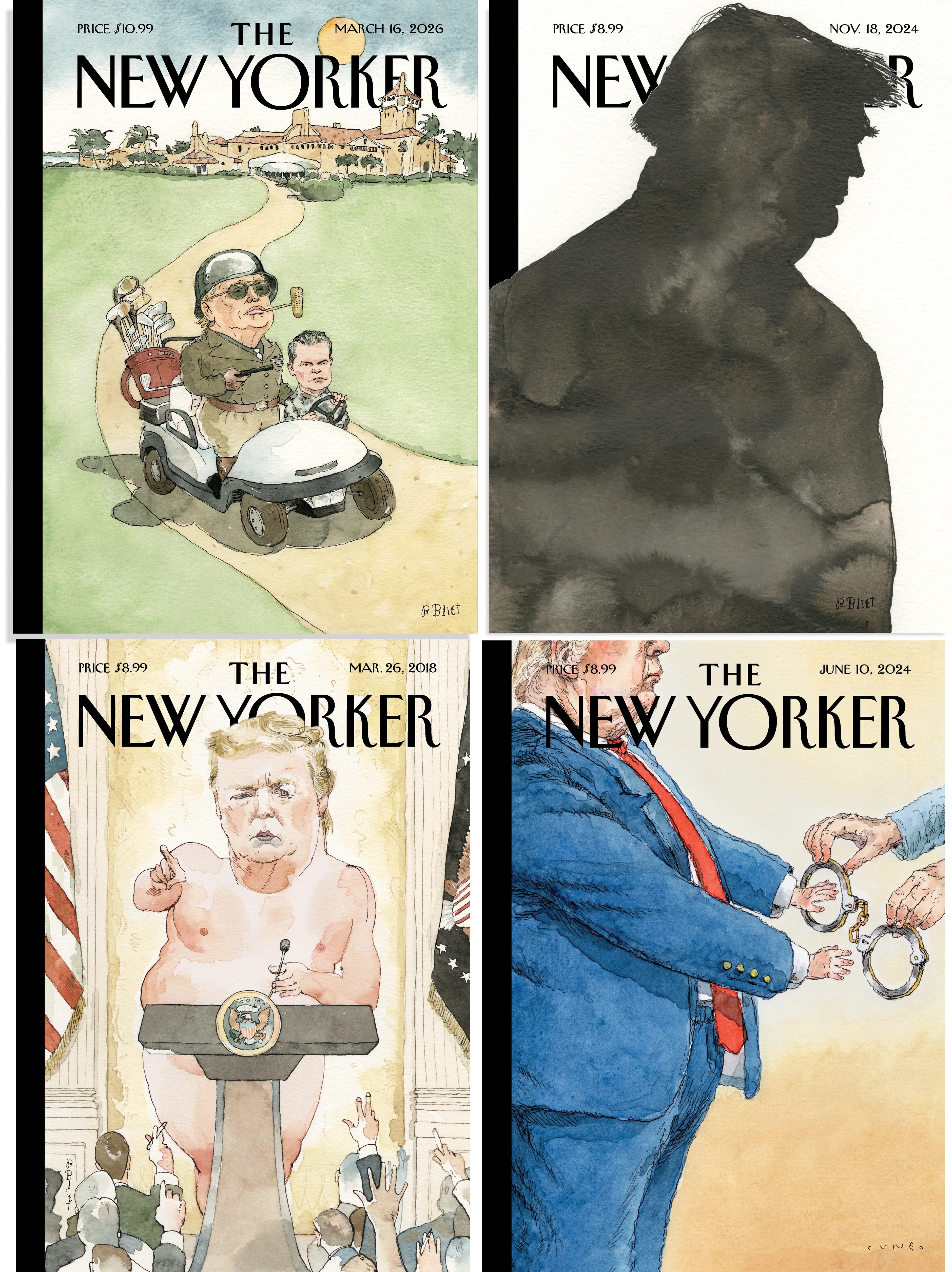
Or take The New Yorker: artist Barry Blitt produced dozens of Trump covers that are both critical and inventive, using satire and exaggeration to turn political commentary into striking visual ideas.
More recently, the tone shifts again. Covers have become more direct and more literal, leaving less room for metaphor or play. The message is immediate, with little attempt to soften or disguise it.
In simple terms: earlier covers play and suggest, later covers confront, and recent covers state.
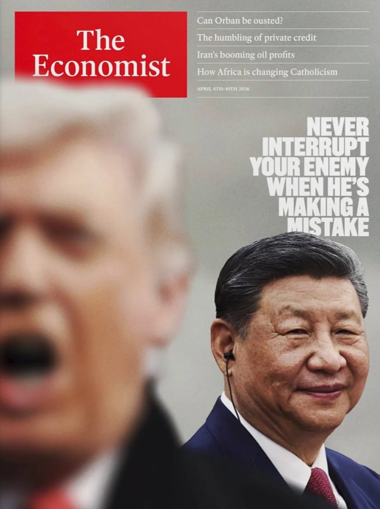
The Economist 2026
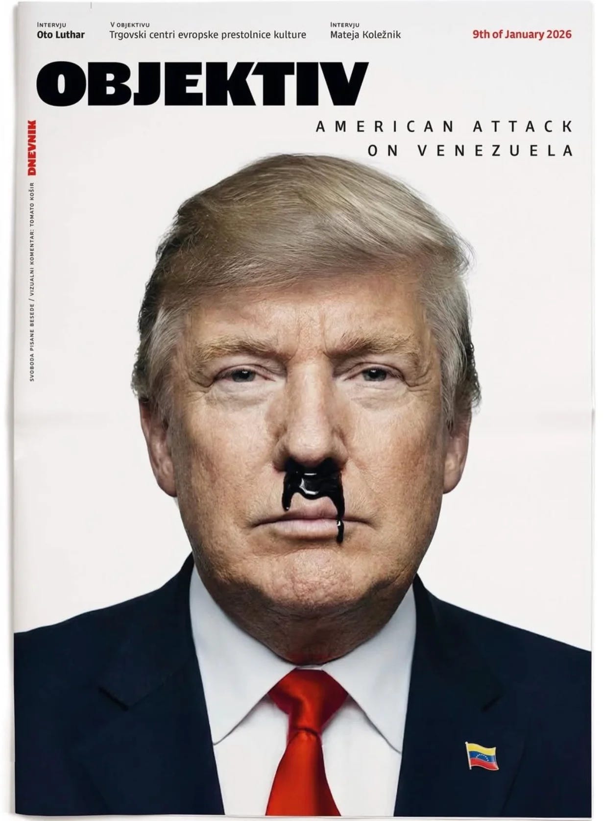
Objektiv (Slovenia) 2025, designed by Tomato Kosir, read here more about this cover
Taken together, these covers form a timeline — not just of one person, but of how editorial design responds when a subject remains constantly present.
The question is no longer how to visualise Trump, but whether there is still a way to do it that adds something new. I still believe in the creativity of designers, that they will find a way forward. I’m curious to see how.
Let me know your thoughts! (and send me examples if I missed a good one)
More soon.
Der Spiegel 2016
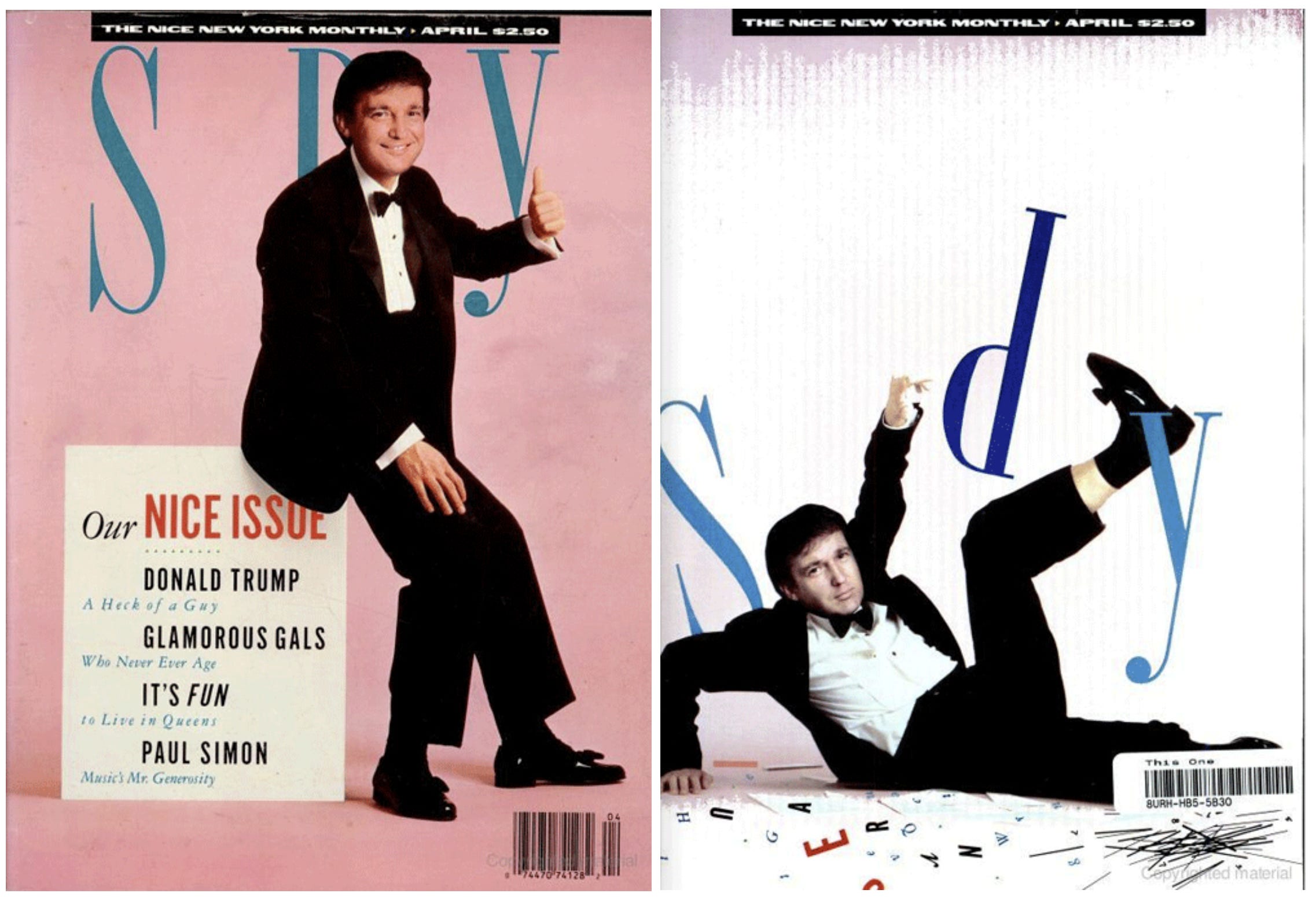
Spy magazine 1988
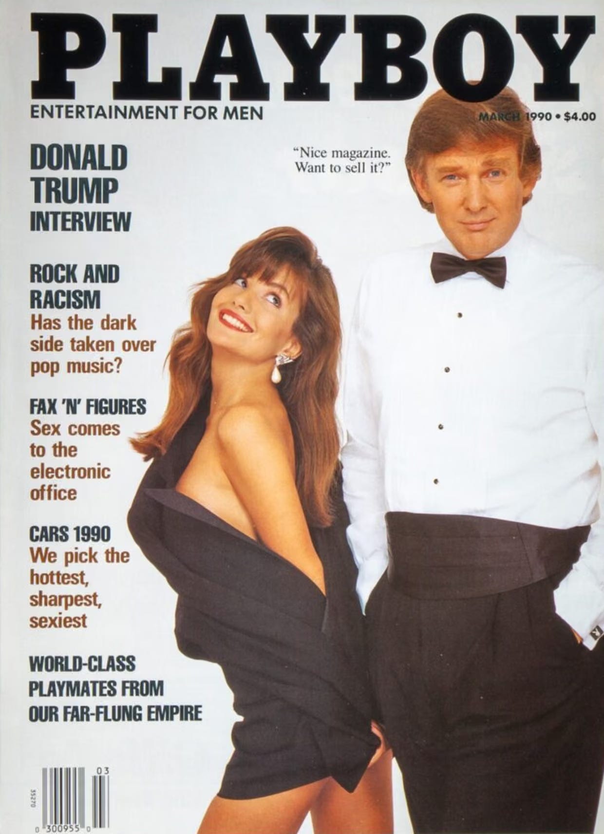
Playboy magazine 1990
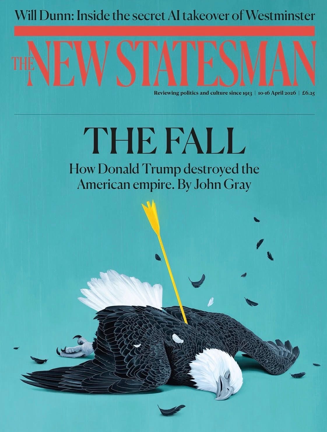
The New Statesman 2026
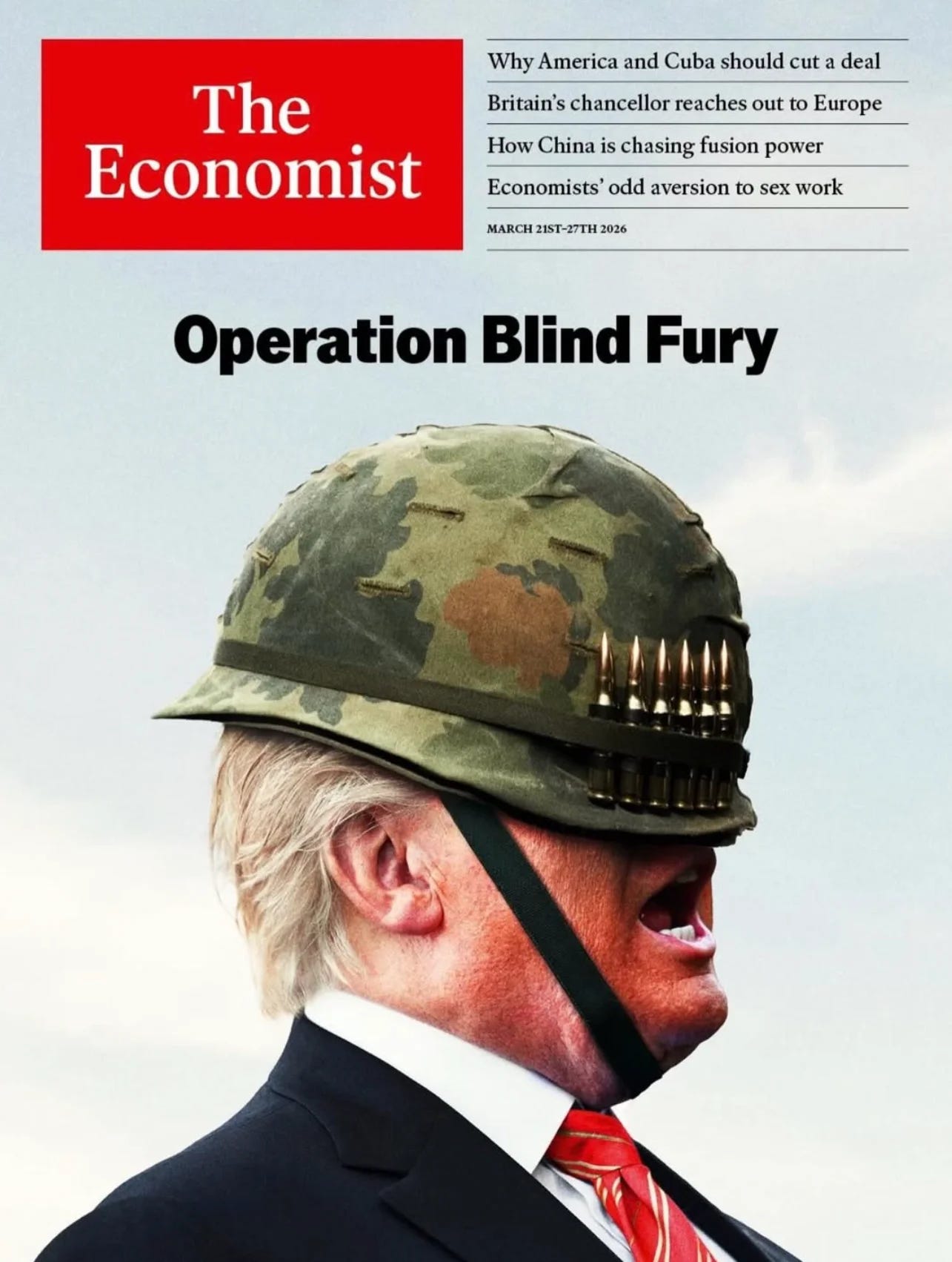
The Economist 2026
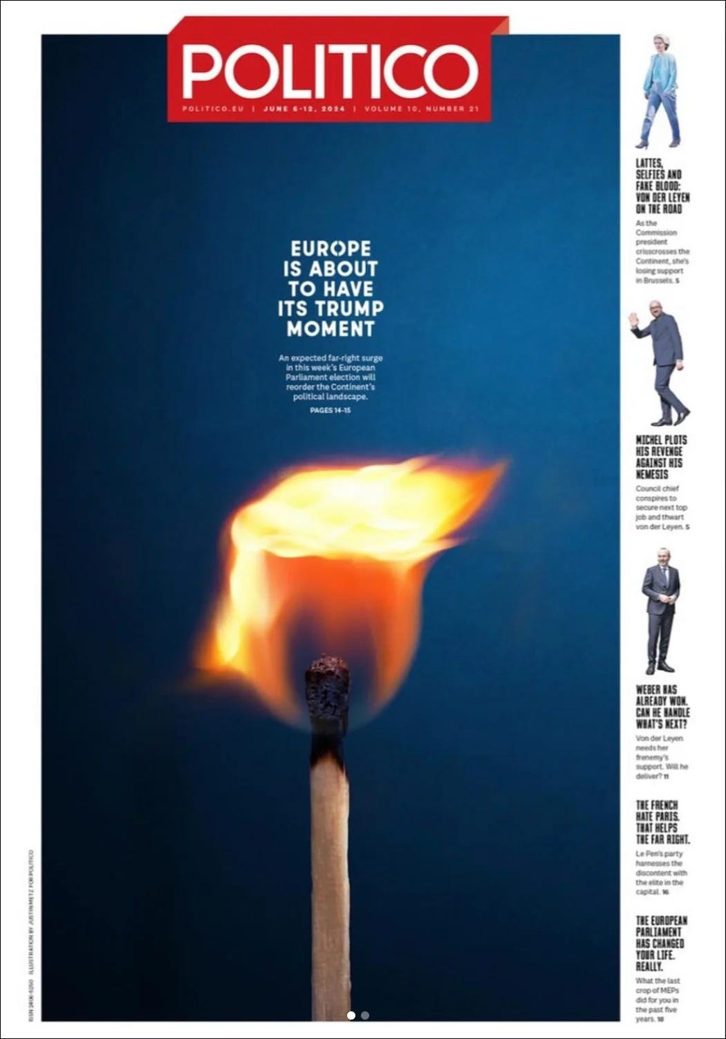
Politico 2024
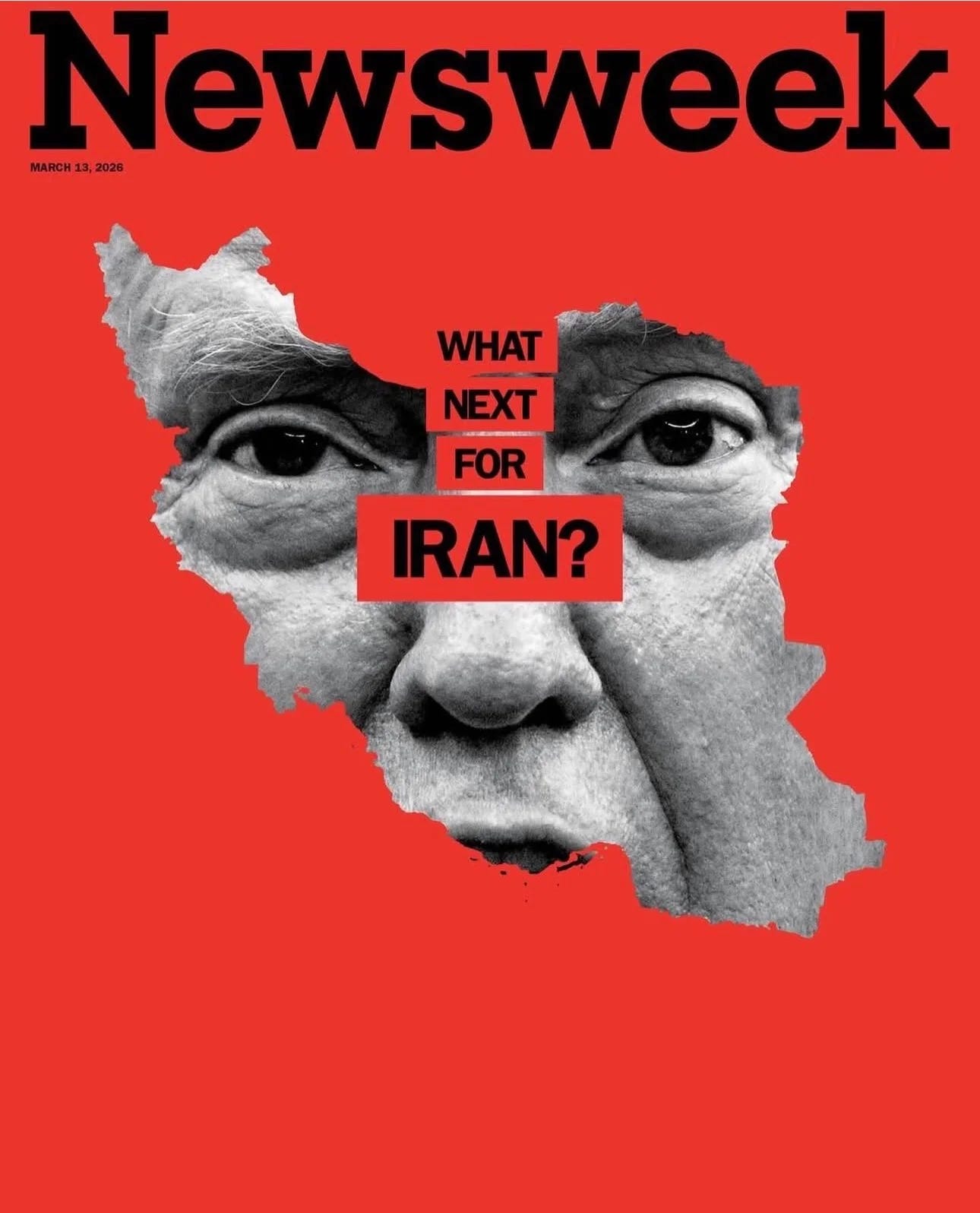
Newsweek 2026
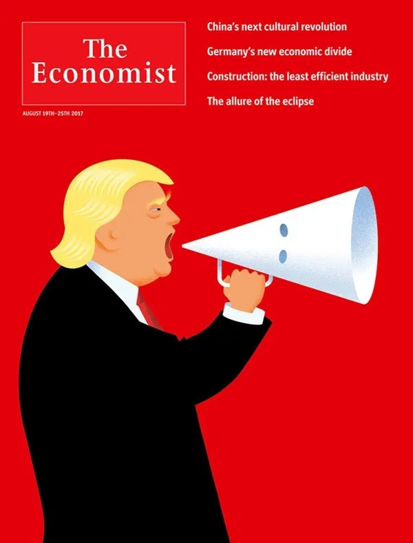
The Economist 2017
Thanks for this overview, great read!
I haven't been able to get the SPIEGEL asteroid cover out of my head since I first saw it.