
How to design porn & pixels
a bold cover about porn that nobody dares to put on a cover?

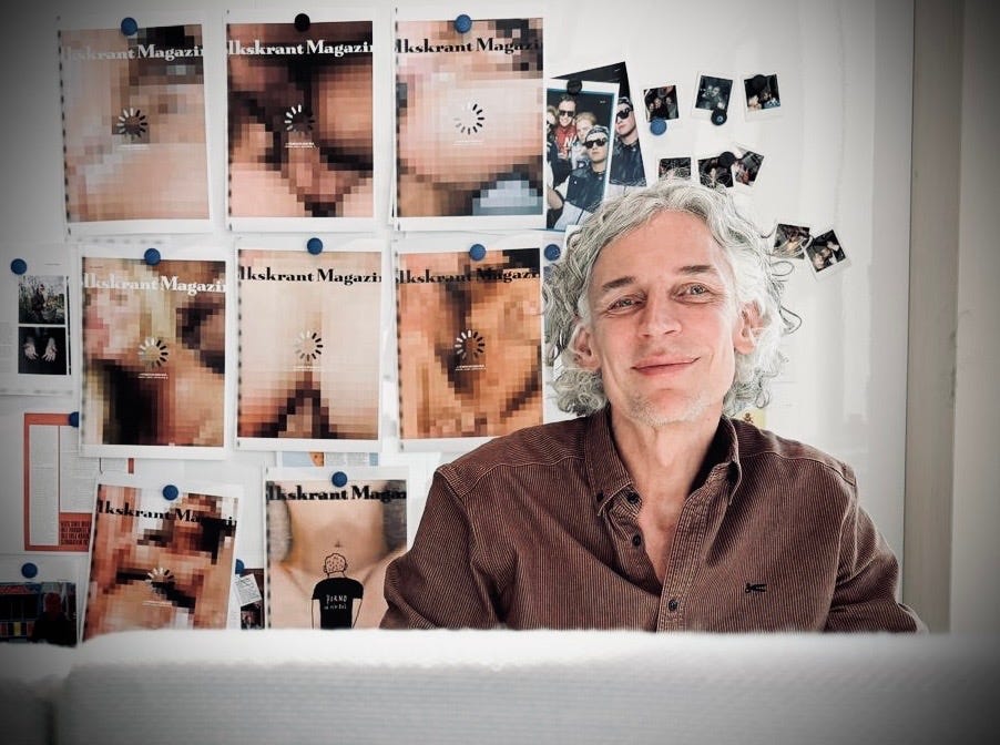
Me, at the Volkskrant Magazine newsroom.
No editors were harmed during the making of this cover (possibly a few subscribers)
The first thing I heard was giggling from the far end of the Volkskrant newsroom.
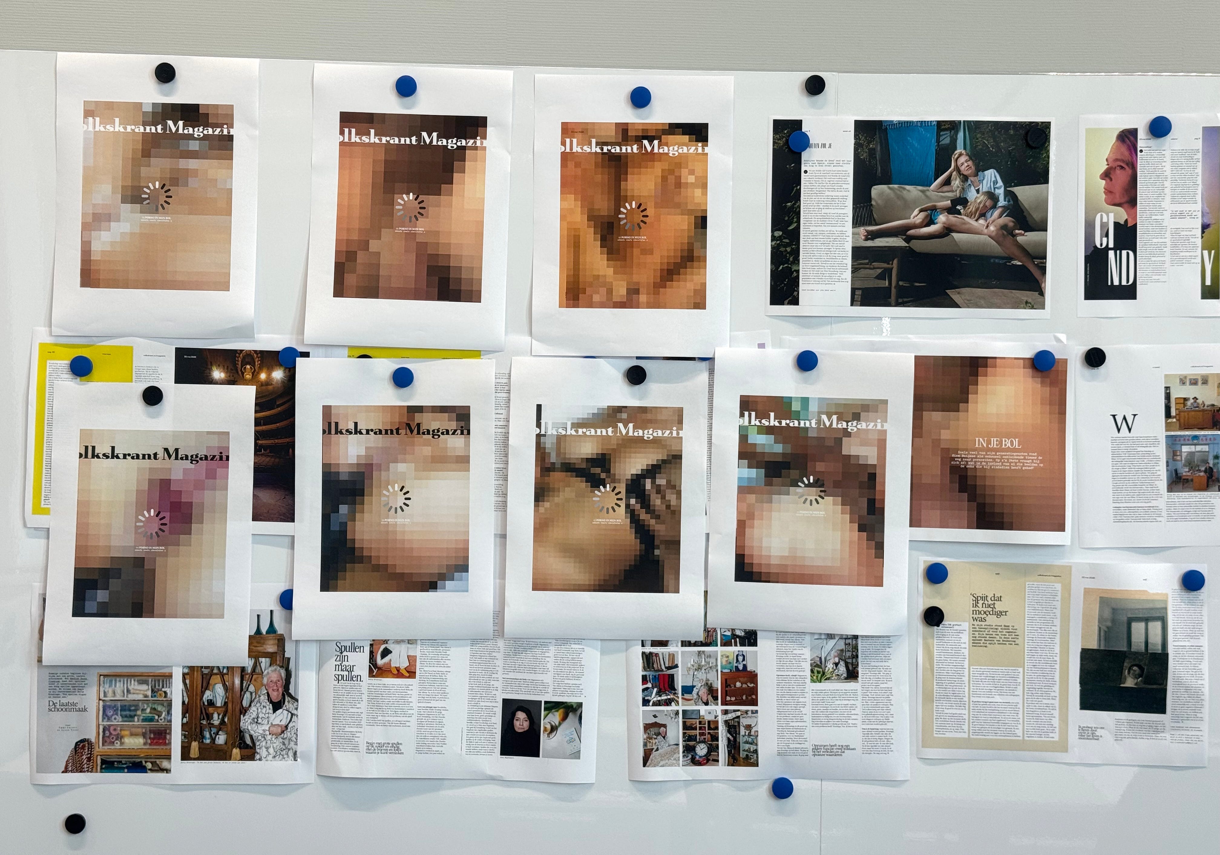
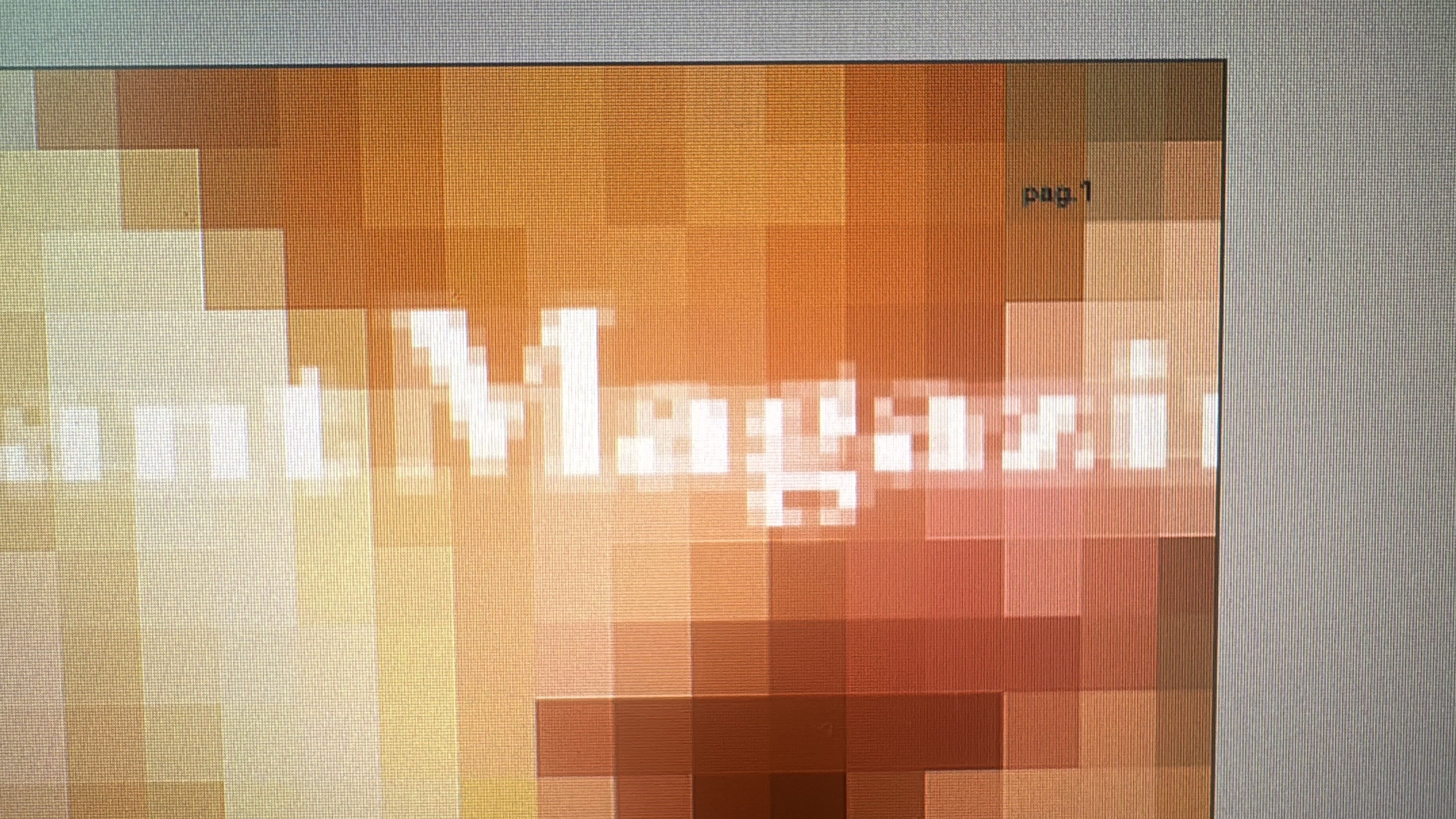
I was pinning early cover sketches onto the wall. Giant pixelated abstractions based on explicit porn imagery. I genuinely couldn’t see what the fuss was about anymore. I was staring at pixels, blocks, beige squares, brown squares. Digital soup.
But from across the studio, things became very clear. That was the strange magic of this cover. Up close, the sketches looked harmless, abstract. I even admired the color palettes at that point. But from afar, the brain connected the dots instantly. The image suddenly became obvious, way more direct than I had hoped.
The design dilemma: How to design a magazine cover about pornography without making pornography?
The story inside Volkskrant Magazine was written by a 25-year-old man reflecting on how growing up with online pornography shaped his sexuality and ideas about intimacy. A personal piece, full of uncomfortable questions: which desires are truly yours, and which ones were shaped by algorithmic escalation?
Designing a cover for that story meant navigating a very awkward line. You want readers to instantly understand the subject matter, but not in a way that turns the magazine itself into clickbait porn. The challenge wasn’t just what to show, but how little you could show while the image still remained unmistakable.

An early sketch of the cover
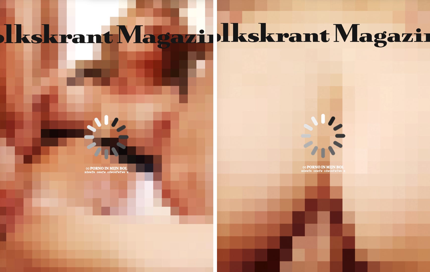
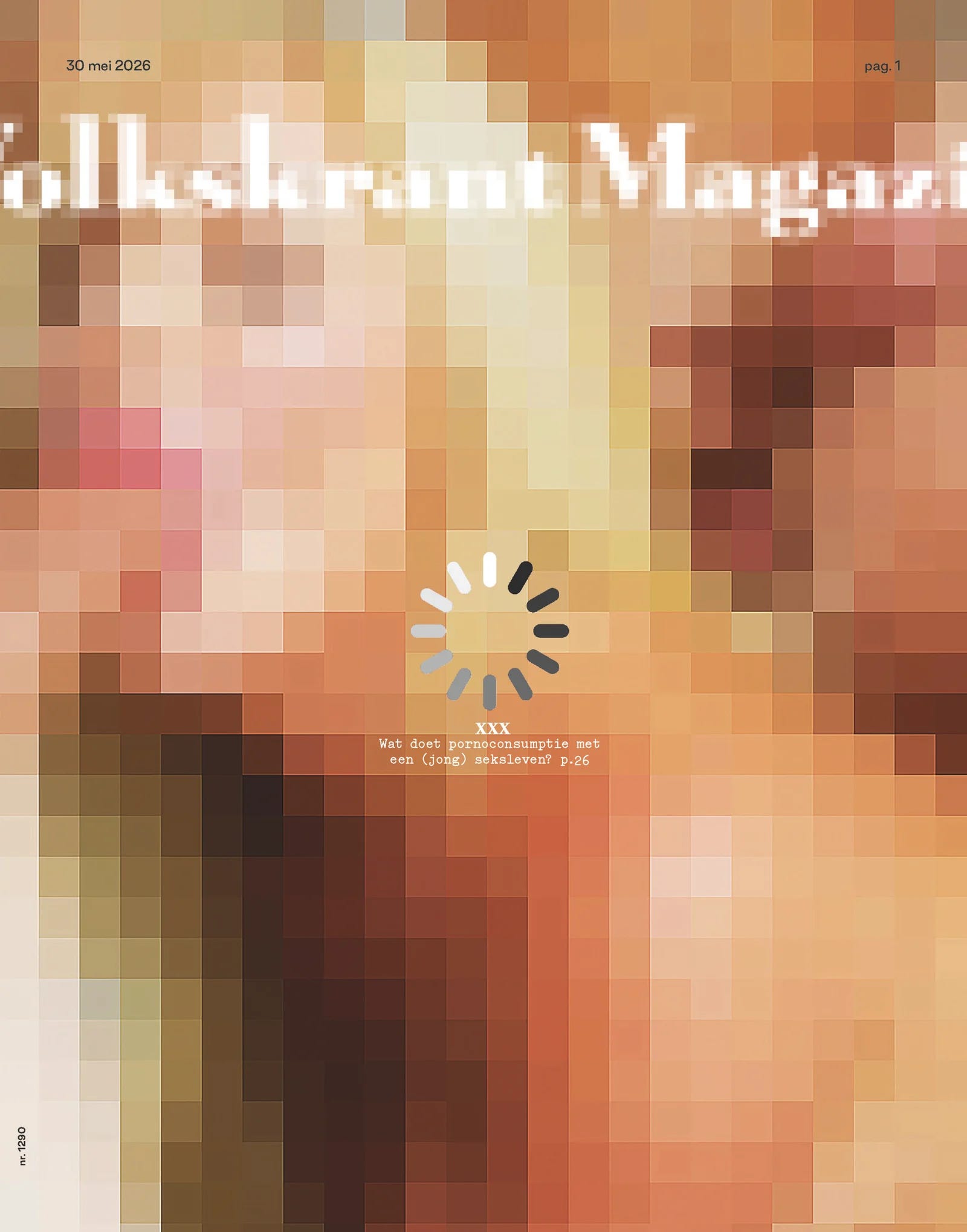
The answer became the pixel. The pixel is digital imagery. Zoom into any online image far enough and everything eventually turns into blocks. That felt strangely fitting for a story about growing up with internet pornography.
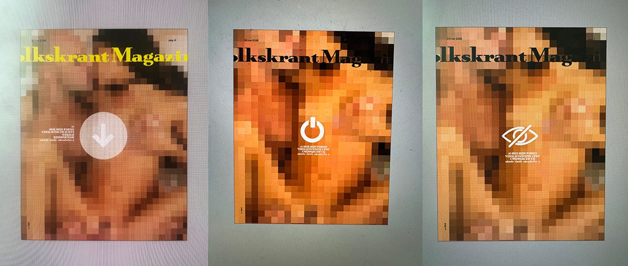
I started wondering if the concept needed a graphic icon in the middle
Printed large, the cover almost behaved like an optical illusion. Up close, it looked abstract. From afar, it became recognition. But on social media, the image suddenly shrank dramatically and the pixels visually merged together. The exact same cover became far more explicit on a phone screen than it ever felt in print.
So we started testing and talking about this endlessly: how big should the blocks be? At what point does suggestion become exposure?
Raw sketches by Paul Faassen
There were many detours along the way. Illustrator Paul Faassen created several variations featuring a drawn young man, a stand-in for the writer himself, confronting the blurred imagery. Those sketches shifted the project into a more psychological direction: less anonymous porn, more personal confusion.
Logo treatment by designer Marco Stoker
Some sketches were too obvious. Others became unintentionally funny. I I added the wheel, some versions looked strangely innocent up close and shockingly dirty from ten meters away. Which, honestly, felt conceptually perfect to me.
Researching porn while sitting in the middle of a newsroom definitely adds a certain adrenaline to the design process. Suddenly every colleague walking past your desk develops an intense curiosity about your screen.
That said, presenting giant pixelated porn sketches during completely serious editorial meetings, and silently observing everyone trying to behave normally, was one of the more entertaining parts of this project.
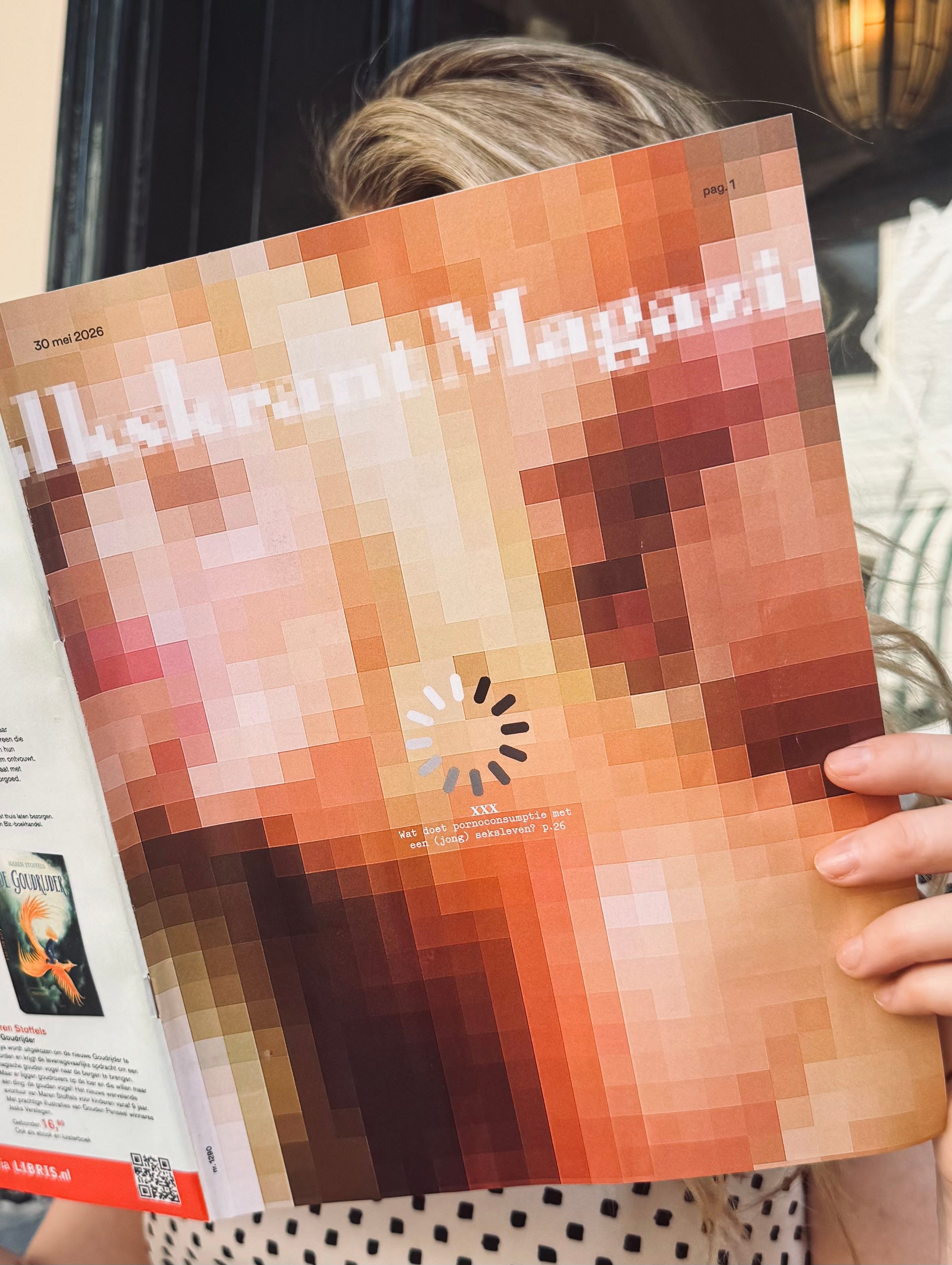
The final cover Volkskrant Magazine.
No editors were harmed during the making of this cover (possibly a few subscribers)
But I have to be honest here, I'm mildly sweating over this cover landing on people's doormats this Saturday. The final cover is pictured above.
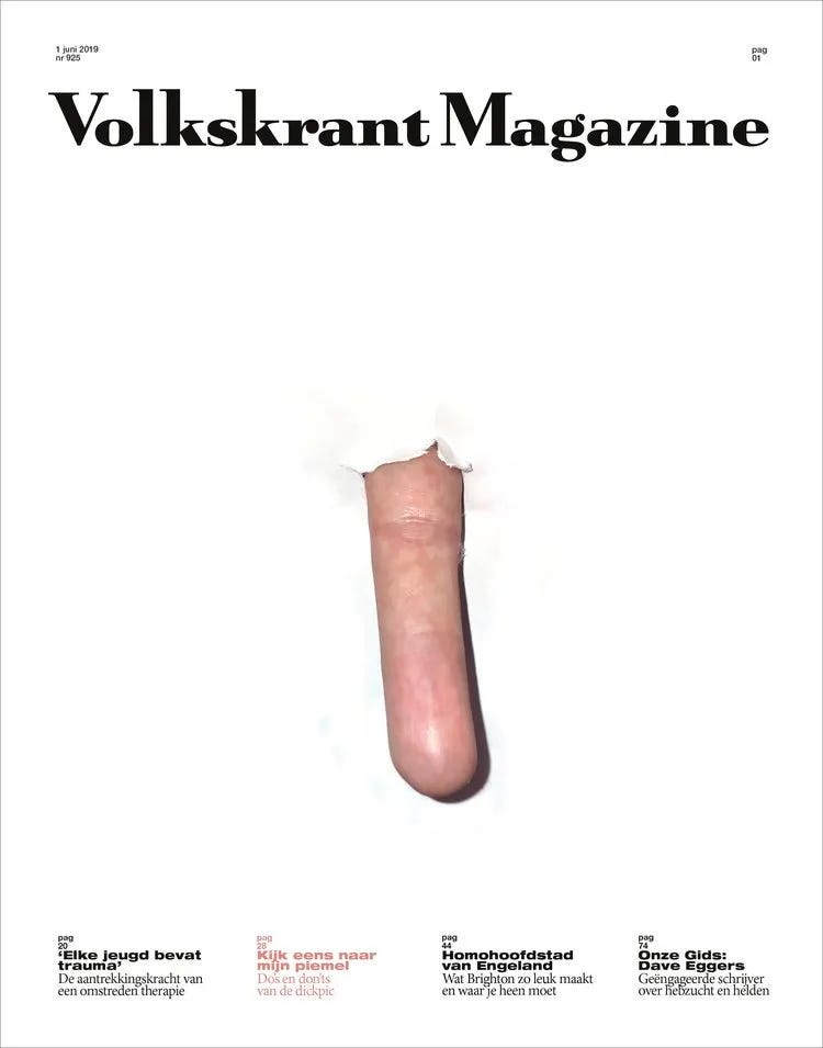
A few years ago, I designed a cover about dickpics (see underneath) that triggered more than fifty subscription cancellations. It took some time to calm everybody down. After publication we called readers personally and explained the story, the intention and context. Surprisingly often resubscribed. But I still remember the outrage.
Cover Volkskrant Magazine, artwork Beni Bischof
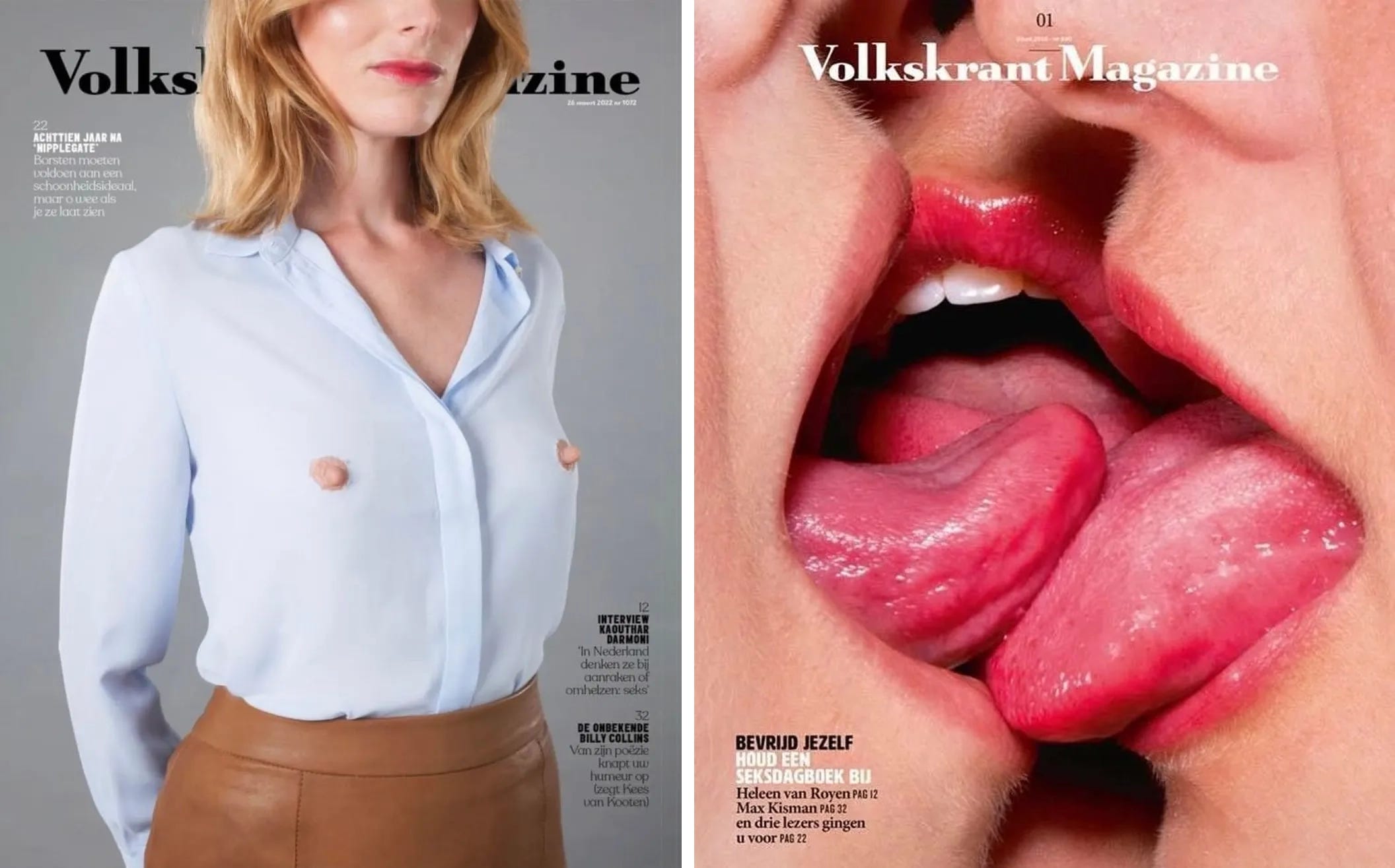
Selection human skin-covers I designed for Volkskrant Magazine
Human skin, flesh and body fragments keep returning in my cover work for some reason (see above and below). Skin, fragments, intimacy, suggestion, maybe that’s part of this story too.
Ten years ago, I probably would have designed this cover differently. Less cautious. More direct. But the context around images has changed completely. Covers no longer live only on paper. They instantly travel through Instagram feeds and WhatsApp screenshots. A magazine cover now also has to survive algorithms and social media morality.
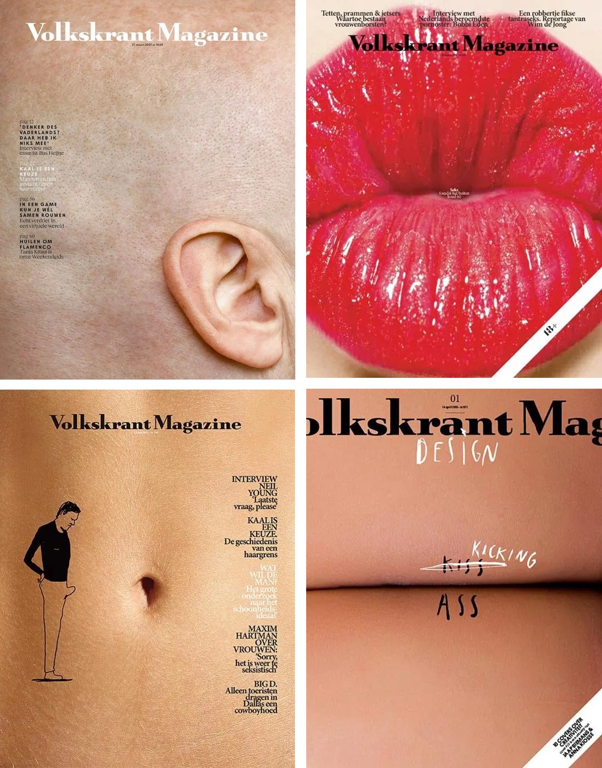
Selection covers I designed myself for Volkskrant Magazine
Which is ironic, really. Pornography has never been more available, more visible. Yet culturally, we somehow became more nervous about images.
So yes, somewhere between the pixels, there’s probably also a designer nervously moving blocks around. Maybe that’s why this cover ended up becoming less about pornography itself, and more about where exactly we think the line still is.
Happy Sunday, design lovers. See you next cover.
Reduced to this scale one can see a hint of the original image. In print it’s just pixels in fleshtones. Great work!
Very insightful!